
Elevating Marketing Collatoral
Yurtshire:
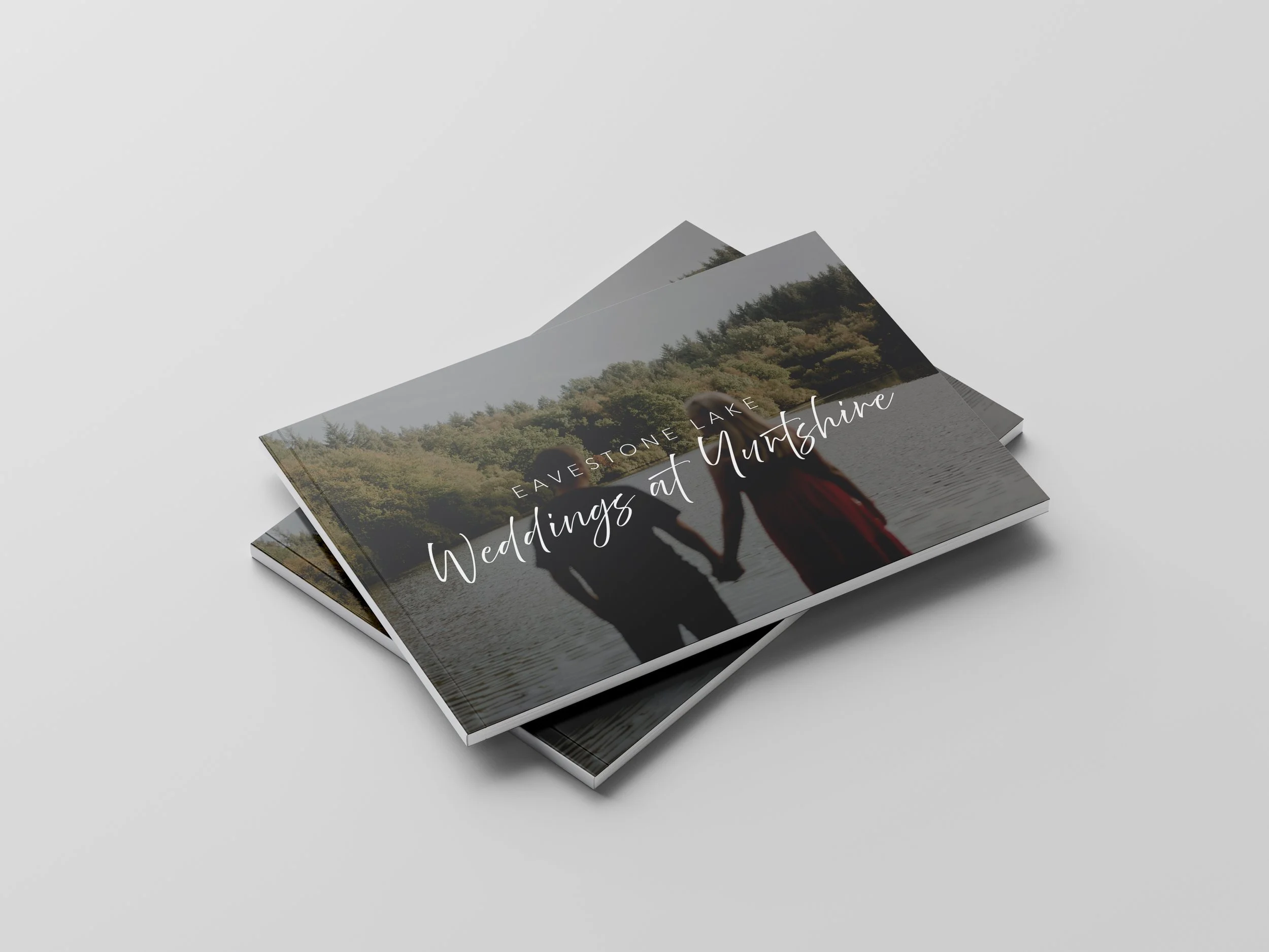
Weddings at Eavestone Lake
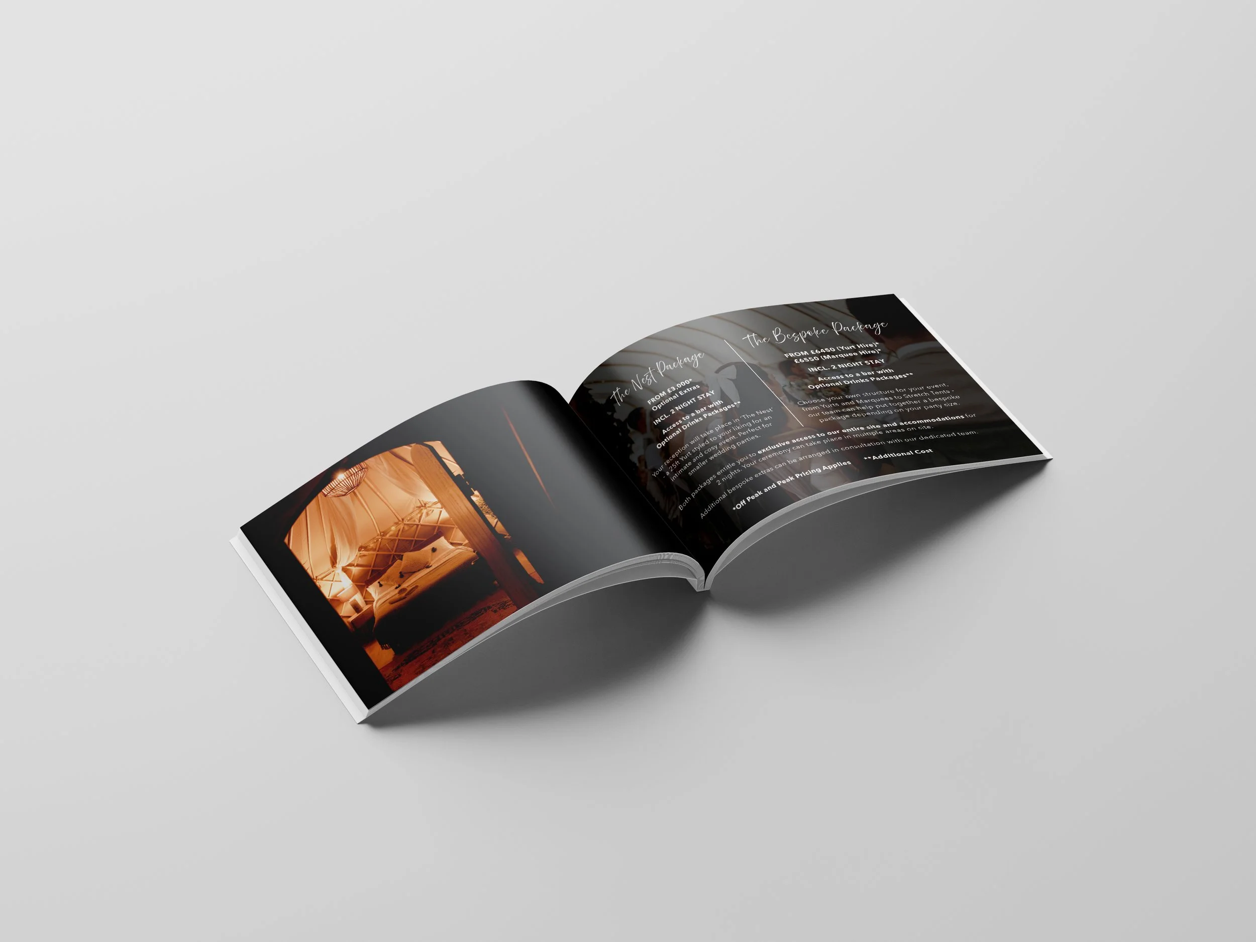
The wedding brochure for Eavestone Lake had been on the to-do list at Yurtshire for a while when I first took on my role as Events and Marketing Coordinator. My aim was to make it clear, well-structured, and unmistakably on brand. By redefining and simplifying our wedding packages - the redesign made it easier for couples to see, at a glance, what’s included and how each option fits their needs.
I fixed the flow so it guides readers naturally - from specific imagery that provides the first impression of the venue, to details of each package, to how to book. I also refreshed the design with our brand colours, typography, and imagery, so it feels like an extension of the experiences we already offer at Yurtshire, Eavestone Lake.
Now, Yurtshire has a brochure that is readily available to show or send couples when they send over an enquiry form.

Wellness at Eavestone Lake
When I first joined Yurtshire, one of the key goals was to encourage guests to make the most of the wellness experiences available at Eavestone Lake. Many visitors arrived without realising the range of extras on offer, so I created a trifold brochure to showcase them - from yoga classes and spa treatments to outdoor activities.
My aim was to design something clear, inviting, and practical, giving guests all the information they need in one place and making it easy for them to get involved during their stay.
I structured the content so guests can quickly find what’s on, when it’s happening, and how to book. The layout separates the schedule, activity descriptions, and treatment menu into easy-to-scan sections, while the design reflects the brand with consistent colours, typography, and tone of voice (matching with the website).
The result is a brochure that works equally well in guest welcome packs and at reception - a practical, on brand piece that showcases the variety of wellness experiences Yurtshire offers.


Yoga in the Forest
I designed this flyer to promote yoga classes at Yurtshire, with the aim of targeting local visitors who aren’t necessarily staying overnight. The design uses natural colours and forest imagery to convey the outdoor experience, paired with clean typography for easy readability.
Key details like class times, instructor information, and location are clearly presented to encourage attendance and leave scope for individual Yoga teachers to share the digital version on their social platforms.
The flyer aims to position the Yurtshire, Eavestone Lake as a wellness destination open to the wider community beyond just guests. By expanding our reach, yoga classes fill up faster, generating more revenue without relying solely on existing guests.
