

Merchandise Rebranding
Retro Automotive
I led the design and development of a unique merchandise range for Retro Automotive which reflected the brand’s adventurous spirit but with a bold and playful twist. From initial concept sketches to final production files, I created a variety of pieces including t-shirts and hoodies.
The designs combined custom illustrations with vintage-inspired typography, carefully crafted to appeal to multiple audience demographics.
By managing the entire creative process I ensured each step was completed to the highest quality possible. It was extremely rewarding to see this project come to life, from conception to creation.
Although I experimented with various styles within these designs, I believe they all blend seamlessly, ensuring there's something for everyone.
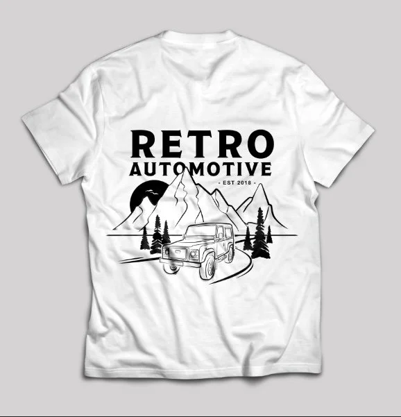
It Start’s With the Car…
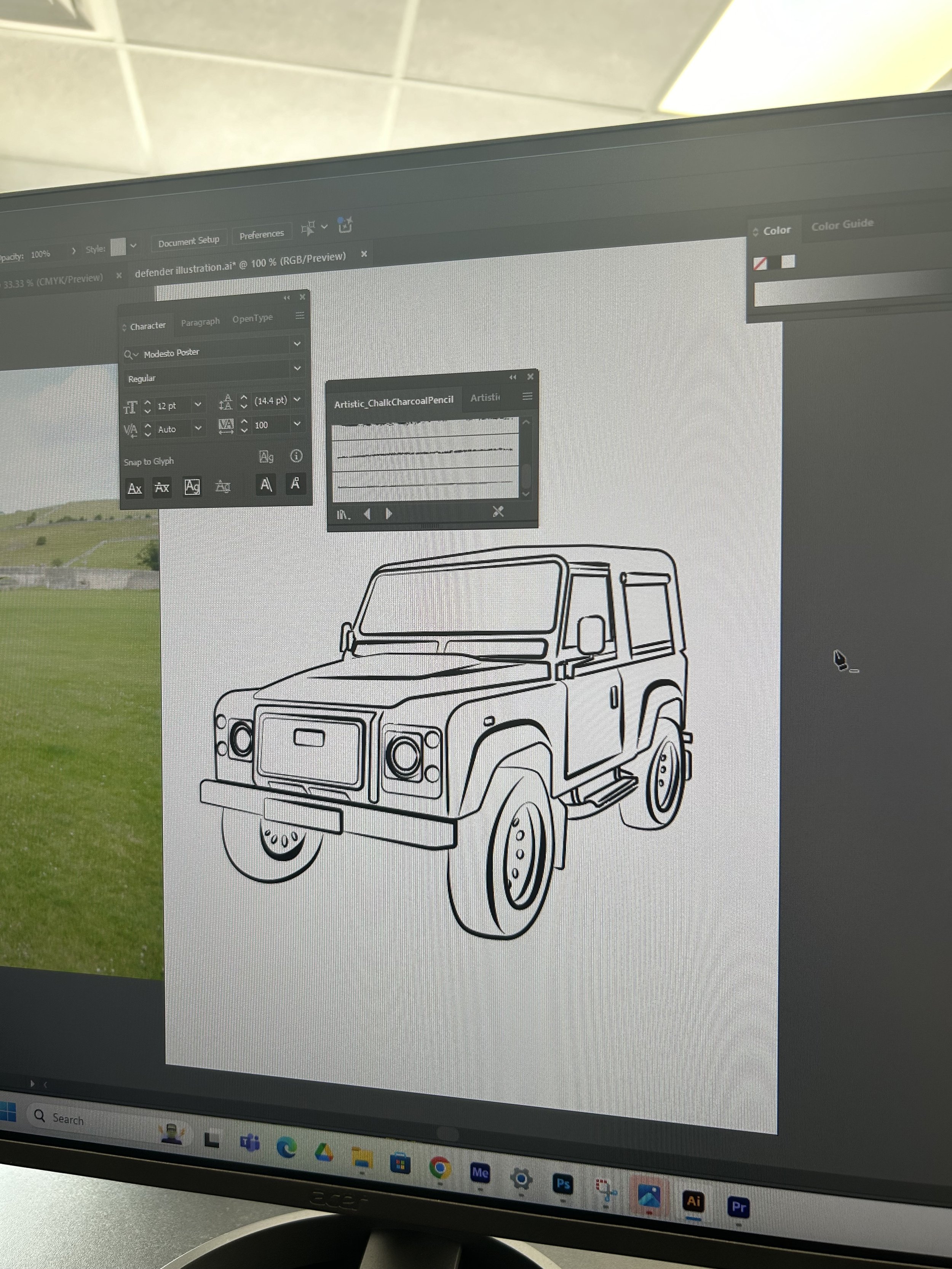
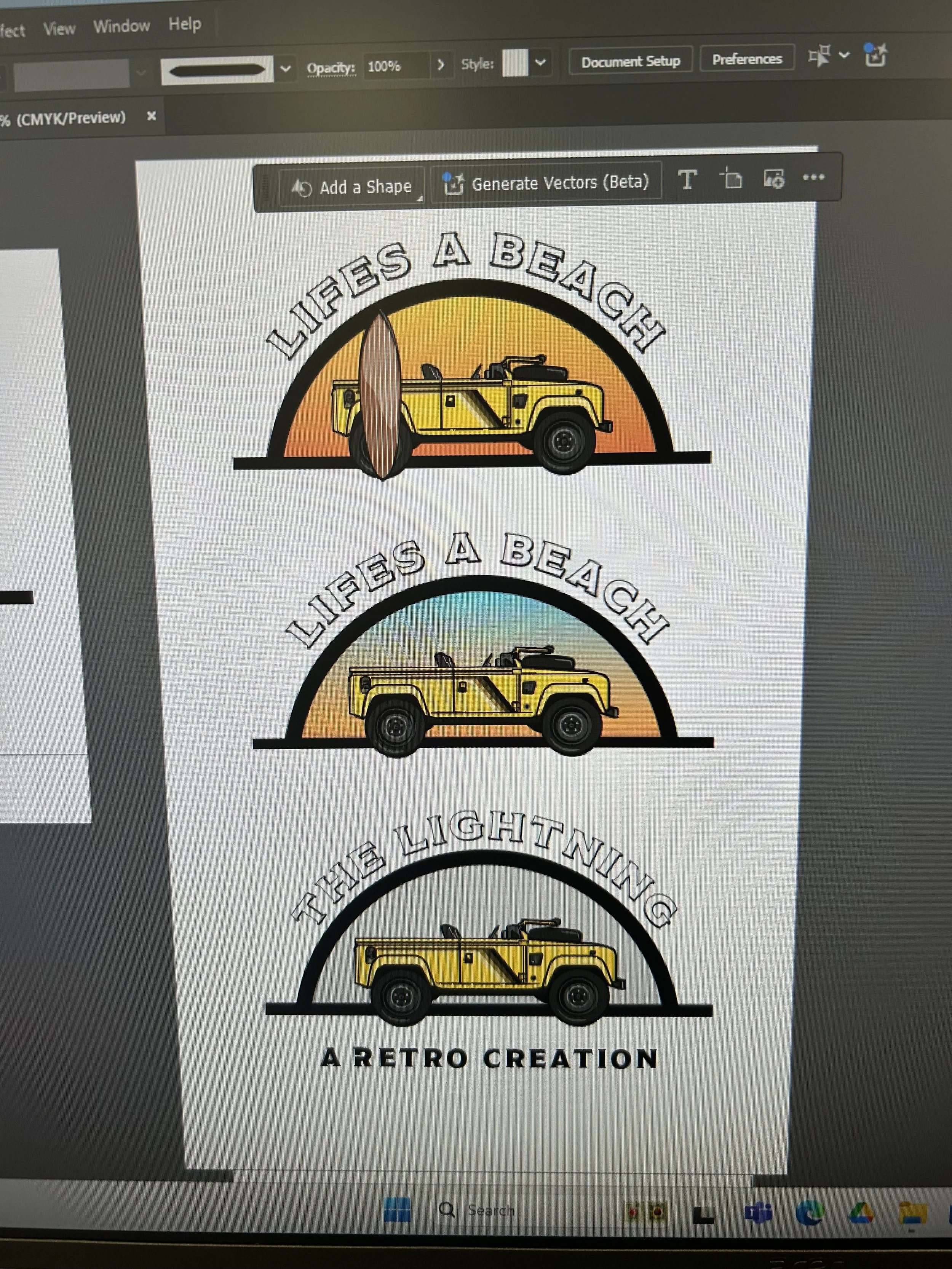
We’ve got to start somewhere, right? Where’s better than an initial sketch of a Land Rover Defender to use as the initial starting point for designs.
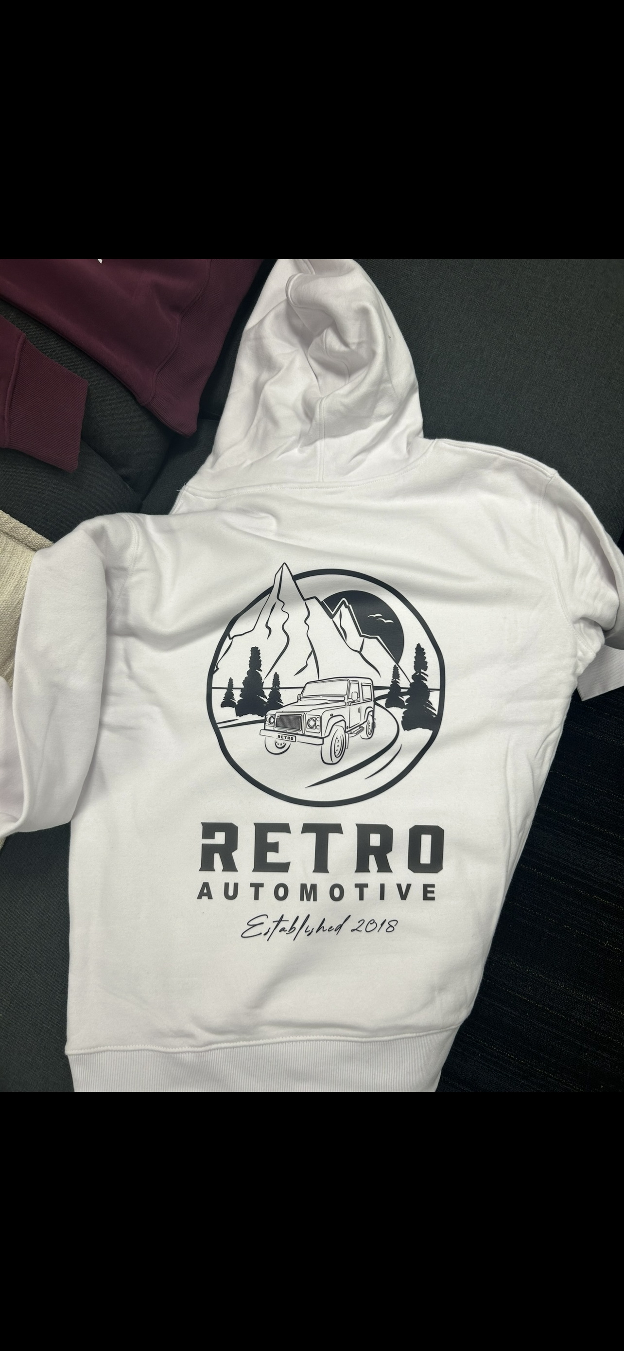
We knew that we wanted a sketched, illustrated feel to the merchandise - simplified, slick, while still being a recognisable vehicle. At this point, the aim was to include limited colour, and this base set me up for lots of experimentation.
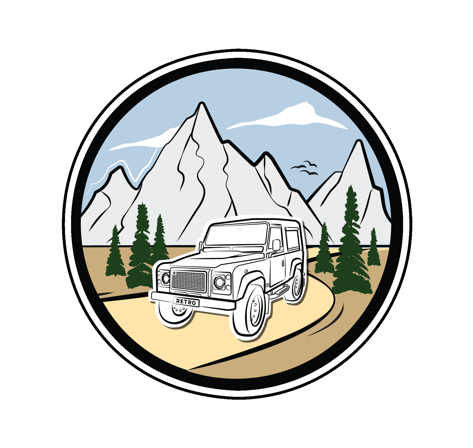
Traditional but Trendy
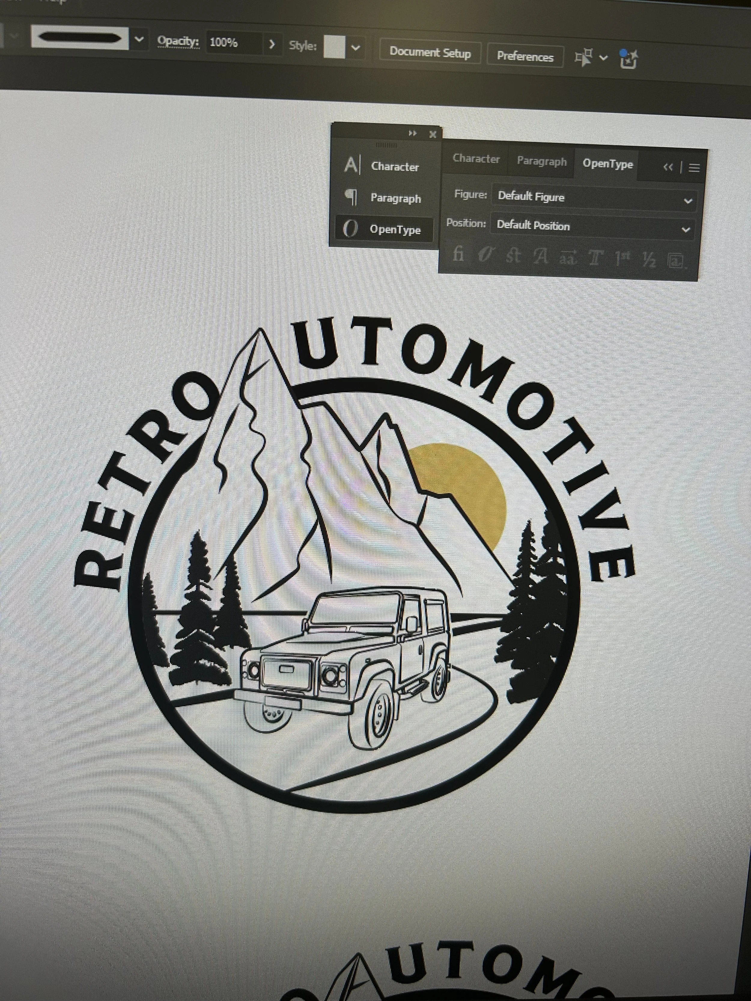
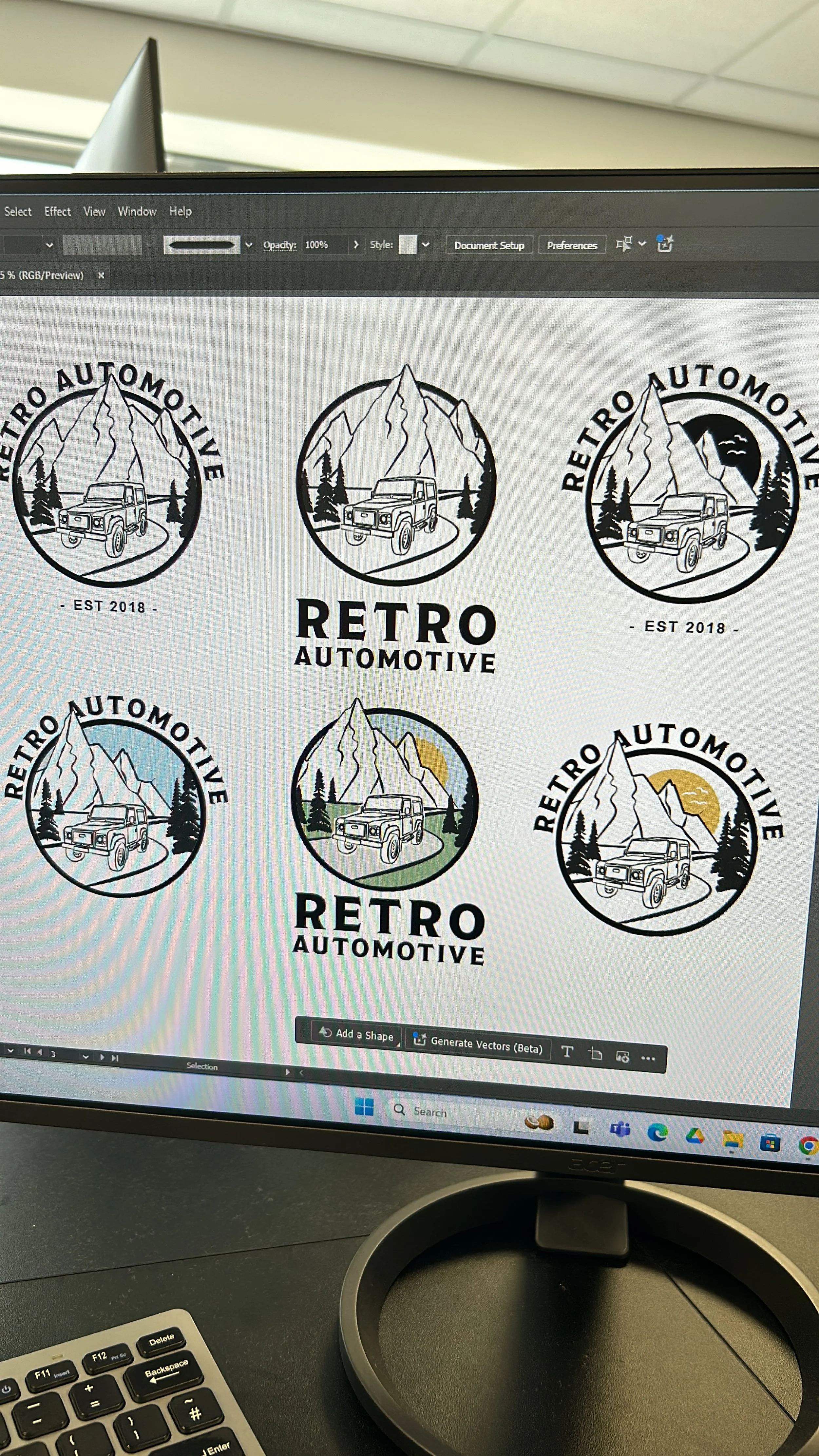
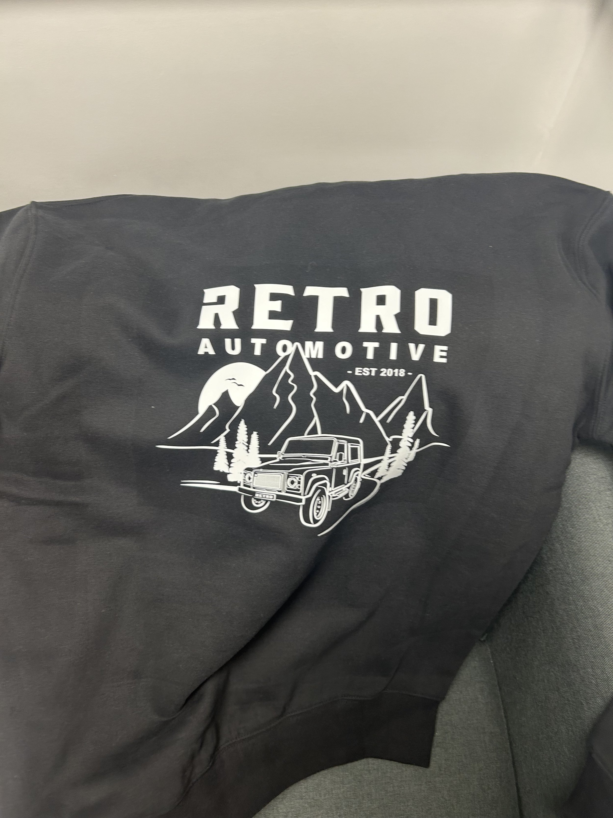
A huge aspect that the boss’ wanted to get across was the heritage and uses of the original LandRover Defender. These initial sketches all included the vehicle in-situ - with mountainous backgrounds and a winding road to reflect the adventurous and ‘epic’ spirit of the car.
We wanted to stay traditional, whilst incorporating a fun and modern feel to the merchandise. We also wanted it to look different than other brands, and different to any apparel we had produced before.
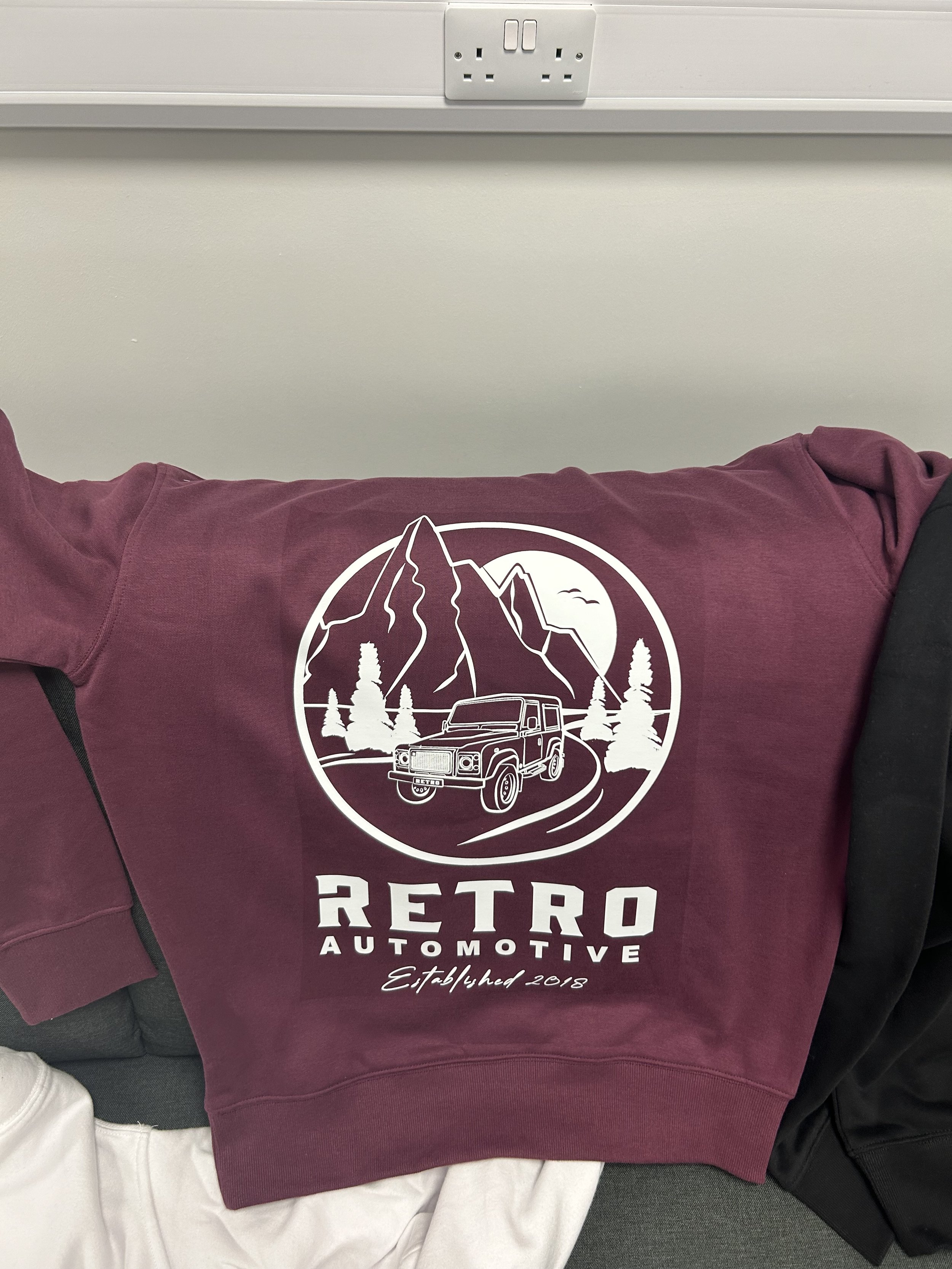
At this point I decided to experiment with colour - muted, subtle shades that complimented the simple nature of the illustration. I also experimented with typography placement.
That’s when a spanner was thrown in the works…

Let’s Switch it Up
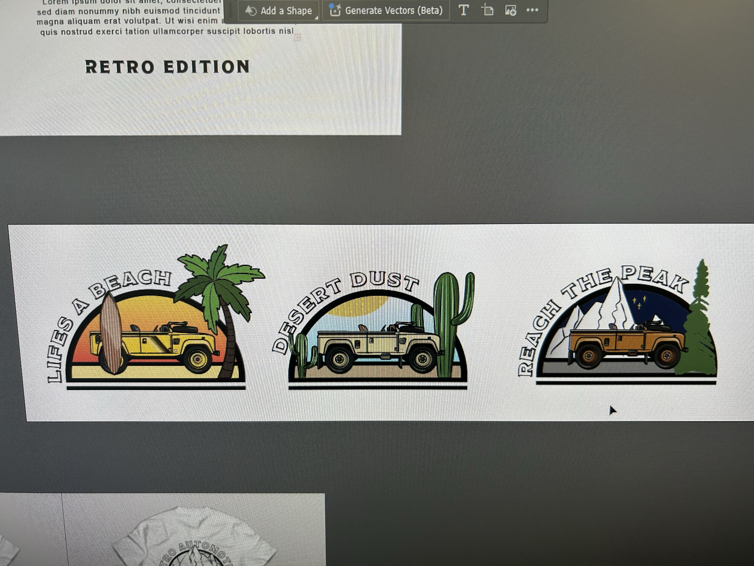
Going down a completely different direction, I experimented with a new car illustration, bold colours and bold typography. I loved this ‘quirky’ style and the detail that contrasted the simple sketchy vibe of the other designs.
Adding a surfboard added a whole separate dimension, suddenly we wanted to prove how the Land Rover Defender wasn’t just a rugged machine - but could be used as a trendy beach runner. This ‘surfer’ style design is something we fell in love with.
Defender’s aren’t typically associated with the beach - this design would make us stand out - and why not add a palm tree for good measure.
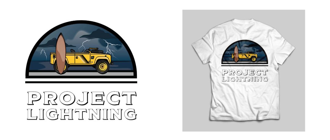
Project Lightning
A design that didn’t go to print (but I wish it did) was Project Lightning. While a bright yellow would typically be associated with sunshine and summer, the electric shade did something different to our team - it reminded us of thunder and lightning.
With its graphical/cartoony appearance and the juxtaposition of the yellow against the deep blue - I love this concept. I think it worked perfectly with the typography choice and ultimately was a modern yet Retro feeling design.

Decision Time
Then suddenly it was out of my hands. After weeks of concepts, hours in Illustrator and juggling everyone’s opinions, I handed over several print ready files to my boss and left the rest to fate.
A few weeks later, these came in the post. Initially yes, I was sad that Project Lightning didn’t make the cut - but Life’s a Beach just about made up for it. Combining more traditional design with a more modern one gave variety to the apparel redesign, proving that the company is as versatile as the cars they make.
These contrasting styles also meant that multiple audiences were reached - those focused on heritage and tradition, and those looking for a ‘cool’ car that they can rock up to the beach in.
This project was very very fun, I loved the freedom and the opportunity to explore so many different avenues. Ultimately, I was happy with the finished products - though I will forever hold a grudge about Project Lightning.